 Men’s Health Cover – This cover layout is consistent and the colour scheme is continual, making sure the readers will always want to buy the magazine and notice it’s consistency. There are underlines and boxes seperating the text and headlines. The bold red used on the text against the cool black, white and greys of the image emphasises both the cover model and the text/masthead, as they clash with each other. I have noticed on most of their covers, Men’s Health tend to use eye-catching statistics, which makes the target audience, again, want to buy the magazine. The cover holds the most important parts of text, and influences the whole magazine, making sure the audience will want to buy it. The cover model, Jason Statham, is certainly an known-icon around the world, and models for Men’s Health because his body projects a fit and healthy image for the magazine and most of the target audience will want to read about him. The cover model image is also covering the masthead, suggesting this is a well-known magazine and is easily recognisable. Men’s Health holds high reputation, dominating most fitness magazines for men, as shown clearly by just the cover.
") Elle Cover – This cover is extremely plain, which creates a strong emphasis on the cover model. I have noticed the masthead is unusually faded and slightly transparent (typically it is bold and black), again emphasising the cover model and what it represents. Keira Knightly is used on this cover as she is known across the world as a fashion icon, she models for the likes of Chanel and is also a well-received actress. She is also extremely beautiful and both her and her appearance (makeup, clothing, pose etc) fit well with the crisp, chic, polished vibe I get from this cover of Elle. Nearer the bottom of the cover the text reads ‘Keira by Tom Ford’, this text is interestingly used as it gives away next to nothing about the magazine or the cover story. This is an odd yet extremely clever technique as the target audience and regular buyers are drawn to the magazine as it stands out from the shelf as the only cover with almost no text on it.
Elle Cover – This cover is extremely plain, which creates a strong emphasis on the cover model. I have noticed the masthead is unusually faded and slightly transparent (typically it is bold and black), again emphasising the cover model and what it represents. Keira Knightly is used on this cover as she is known across the world as a fashion icon, she models for the likes of Chanel and is also a well-received actress. She is also extremely beautiful and both her and her appearance (makeup, clothing, pose etc) fit well with the crisp, chic, polished vibe I get from this cover of Elle. Nearer the bottom of the cover the text reads ‘Keira by Tom Ford’, this text is interestingly used as it gives away next to nothing about the magazine or the cover story. This is an odd yet extremely clever technique as the target audience and regular buyers are drawn to the magazine as it stands out from the shelf as the only cover with almost no text on it.
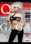
") Elle Cover (2) – This is extremely similar to the above; however, here we see more text down the left hand side, slightly angled giving the magazine an urban feel. Lady Gaga’s ridiculously massive hat dominates the magazine cover, resulting in having to separate the masthead into two. This technique emphasises the cover model even more than it already has been, Lady Gaga is an extremely well received and admired around the world artist and fashion icon – which explains why Elle have used her for the cover, and separated the masthead/text, fitting it around her fabulous image. As before, Elle have used Black and White here (tone of image, text, masthead etc), which clashes with the outrageousness of the cover image.
Elle Cover (2) – This is extremely similar to the above; however, here we see more text down the left hand side, slightly angled giving the magazine an urban feel. Lady Gaga’s ridiculously massive hat dominates the magazine cover, resulting in having to separate the masthead into two. This technique emphasises the cover model even more than it already has been, Lady Gaga is an extremely well received and admired around the world artist and fashion icon – which explains why Elle have used her for the cover, and separated the masthead/text, fitting it around her fabulous image. As before, Elle have used Black and White here (tone of image, text, masthead etc), which clashes with the outrageousness of the cover image.
 Q Cover – Here we can see the typical and very well-known Q masthead; this I have noticed is covered by the cover model’s image, which supports how well-known the magazine is and how long the company has been printing it. The cover model, Adele, has been used as she is loved and respected all across the world, which means a lot of readers will be interested in reading/buying the magazine. She seems to have quite angelic styling connoting innocence and purity; her pale skin, bright blue eyes and sweet red hair all contribute to this idea. The cover model has clearly been edited, airbrushed and lightened – her eyes have been emphasised to make them the centre of the image. Another way her stylist has emphasised her eyes is by using false eyelashes and smoky eyed makeup/liner. I have noticed Adele’s lips are tinted a very pale, natural pink, which creates even more emphasis on her eyes. She seems to be looking into the reader’s eyes, and saying ‘Read about me’ – this is the result of her lightened eyes. The photographers have also used a wind machine on Adele’s hair, not only revealing more of her face, but also relating to the text below it ‘BLOWS US AWAY’. The typical red and black colour scheme of this Q cover has been used throughout the years; however, the white has been used to stand out from the cover model’s purple shirt and red hair. This also matches the white background – which can relate to the idea of the cover model looking quite innocent. The same font is used throughout the cover but the text differs in boldness and size. The text is seperated by small, thin black/grey lines and a white box is used on the right bottom corner to again stand out from the cover image. The golden sticker used here is coloured and differs in font because the reason the sticker is used is important; this is advertised as the 300th issue and is styled differently to catch the readers eye, which will hopefully make the reader more likely to want to buy it.
 Interview Cover – On this cover, 80’s pop star and renowned icon around the globe, Madonna is used for the cover story of this issue. She has been known to pull show stopping fashion stunts and release massive chart topping singles, which is why Interview have used her for their cover story – because they know buyers will be interested to read about her. Madonna has been styled/photographed here quite devilishly and evilly. Her downward pose connotes hellish and demonic features. The stylist has styled her eyes to centre the cover, excluding the crucifix, by using really thick false eyelashes and black eye makeup. Religiously, the crucifix used in the centre of the cover image stands out massively, covering most of the cover model’s face. The red smudge of blood-like liquid used across the cross vertically and horizontally suggests connotations of death, pain and bibliographical events. The use of the blood-red becomes the eye catcher of the cover, as it contrasts with the black and white of the cover model and crucifix. This contrasts with the religious, Kabbalah nature that Madonna is known for. The Interview masthead is not my favourite part of this cover, simply because it isn’t bold enough and does not make a statement, which I think a masthead should do. However, the white colour-scheme matches with the black and white cover image and is only used on the darker shades of the image, to make it readable and emphasised. The is not much text on this cover, nor is there any stickers; the only text used is very small and in italic font. Because the text introducing Madonna is so small, and the crucifix hides most of her features, it is not instantly noticeable that the cover story is about Madonna. This may affect the issues sold as the audience may not see the cover model clearly, or the text introducing her clearly. However, Interview editors use the crucifix and blood-red smudges to make the magazine stand out from the other on the shelf.
 Heat Magazine Cover – Personally, I really do not like Heat magazines; I feel they are always edited way too precariously, as if they have no structure and are not at all continuous or consistent. The only use of consistency on this cover is the red colour scheme of the masthead. I have noticed that the masthead has been placed, unusually, nearer centre-left of the magazine, rather than centre/top of the cover. This is to make room for the all important ‘MOST EMBARASSING BEACH PICS 2006’. Also, this story is highlighted in blue and uses a colour scheme of baby pink and white for the text. This emphasises the story as it is placed at the top of the magazine cover and coloured differently. Also, the use of colloquial language such as ‘BUMS!’, ‘BOOBS!’ and ‘DUNKING!’ widens the audience, meaning there is more chance of more people wanting to buy it, different ages, genders etc are involved. The use of the cover model is interesting; she is styled differently to clash with the entire magazine cover. Her expression seems quite sad, even shocked – perhaps matching the shocking rumours that have been released involving her. Her image is tinted slightly golden, which can connote wealth, respect or importance (which can relate to the magazine trying to make her important). Nikki Graham has been styled here with minimal makeup, and seems quite natural looking and her blonde hair can connote ideas of naturalism, innocence or even superficialness. She seems to be drowned out by the rest of the magazine though; we can see that the text surrounding her image is quite brightly coloured and bold, using black, white, red and purple – clashing with the nude colours of her image and her background. The gigantic ‘Nikki’ used below-right of her image is massively bold, very similar to the masthead, showing great importance. Heat have evidently used Nikki Graham for their cover story in this issue, simply because she is known around the UK for reality TV show Big Brother and for being, frankly, a drama queen and attention seeker. Heat editors know gossip magazine-lovers will want to read about her, and are likely to buy the magazine simply because Nikki is the cover story. Two stickers are used on this cover; one advertises first-look pictures of ‘BABY SURI’, coloured in yellow. It’s zig-zagging outline and difference in colour scheme (both text and sticker background) singles the sticker out from the rest of the magazine, as nothing else major is coloured yellow. The second sticker is coloured purple, used for the same reasons as above – the hearts used on this sticker relate to the content of which the stocker is advertising, and are coloured the same as the text boxes on the sticker.
 Atlantan Brides Cover – I am going to analyse this genre of magazine, as I want my examiner to known that I understand how different magazines work and why they use different techniques on their covers. On this Bridal magazine, I dislike the masthead; I don’t think it stand out enough and does not fill the top of the cover, which I think a masthead should do. Even though this is quite a popular bridal magazine in the USA, it looks, to me, as if any old person has made it, as if it had been rushed. However, I do like the photography on this cover and the text choices below the model. As the theme of this cover is clearly ‘Wedding Day GLAMOUR’, both photography and text stick to this theme really well: The cover model’s costume is coloured ivory with golden, vintage-like jewels covering the bust. This really contributes to the glamour theme, as gold connotes wealth. Similar to this, the chandelier and beautiful stately home background suggest vintage and glamourous conventions. The angle in which the cover model is shot is from a low angle or worm’s eye view; she connotes quite angelic and innocent features, her red hair is styled and stand out from the rest of the cover, because of the colour. However, this is not overly emphasised, as the cover model poses her arms over her head. Her angle suggests she could be looking down from heaven, with her angelic features and costume. This relates to the idea of being quite pure on a wedding day, or even religious connotations. In regards to the text nearer the bottom of the cover, it is coloured white, keeping to the theme of the magazine. Most of the smaller text is structured in italics, suggesting elegance and even wealth. The more important text is highlighted bolder, bigger and differs in font (‘GLAMOUR’). All of these contribute to an elegant and glamourous magazine; however, the masthead does not fully do it’s job and would not stand out against all other magazines on the shelf today.
 Empire Cover – I really love this cover; it is eye-catching, unique and uses brilliant techniques to achieve the reader’s attention. The fire used on the masthead is amazing, and really relates the the cover story of Hellboy 2. This animation connotes hellish and devilish themes, as does Hellboy. Again, the cover model partly covers the masthead, showing the magazine is well-known. The blood red of the cover model and masthead are emphasised and stand out from the jet black of the background. The magazine has used white writing for the subject text of the cover; this also clashes with the background, making it important. The use of stickering on this cover advertises ’40 Movies That Will Get You SEX!’, this type of story would make the reader want to buy the magazine, as the audience is opened to late teenage to adults. This sticker is also emphasised by the difference in colouring, however uses the same font as the red of the magazine, making the cover consistent, however repetitive. Moving on to the photography, Hellboy’s eyes have been emphasised to almost be staring into the reader’s eyes: his pose with his fist in his hand connotes violence o0r threat, which could suggest the editors have used this photo to almost threaten the reader, it seems Hellboy is staring at a potential reader, and saying ‘Buy me or I will hurt you’, in a comical fashion anyway.
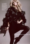
 Q Contents – I really like how Q have used a double page for their contents page/s. It shows how much is in their issue, before the reader has even got to reading what’s inside. They have used the consistent colour scheme of red, same as the front cover, on the lines separating the text and page numbers, the masthead of the contents, the underlining of the photos, and the tiny Q symbols in the bottom corner of each page. The editors have used all types of photos here, with different colours and features. Some black and white, some large, some small, of which all seem quite grainy. A photo of the cover is shown in the top right corner of the second page. This is used to remind the reader of what they wanted to read about on the cover, and then find which page it is on from the contents. In this case, Cheryl Cole’s large black and white photo dominates the contents pages as it is larger than any other photo, and is coloured differently.
 Brides Contents – Here we can see a completely different vibe from this magazine, as opposed to the Q contents above; Brides’ editors have used vibrant orange tones against white background to emphasise the text, such as ‘contents’ or ‘NOVEMBER/DECEMBER 2006’. There is only one photo used here, of a couple enjoying a stroll across the beach during their wedding day. The small subtitle of the photo explains what is used in the photo and why – the purpose: finding the perfect destination for an abroad wedding. I quite like the simplicity of this contents as it relates to the theme of the contents, and could symbolise the simplicity of the couples photographed love – they are staring into each other’s eyes, as if nothing else is around them. The consistent use of one font and only one colour scheme also contributes to the simplicity of the contents.
 Kerrang Double Page Spread (DPS) – Here, we can see a massive photo acting as the background for this DPS; the photo does not completely reveal the band, however this is made up for in the title and other photos, and of course the text. I like the use of black and white, grainy photos on the DPS, it makes the deep red of the title and other features stand out. There is also a clash of theme, the photos come across as quite old fashioned, however contrasts with the slanted title, deep red colour scheme and indie/rock costume and technology shown in photos. The title shown here is a quote, shown by the speech marks (“”). The words ‘THE BEST MCR’ are highlighted in white, different from the before and after text coloured red. The arrow shaped text box advertising ‘WORLD EXCLUSIVE’ is surrounded by stars, and uses all of the colours in the colour scheme – this shows the text is important and emphasises it. I like how the editors have used a white column down the right side of the right page, giving extra information and teasers, advertsing the band itself.
 Q Double Page Spread (DPS) – I really love this DPS, one: because Lady Gaga is the cover story and two: because of how simple yet effective the image and text appears to be. The massive red (consistent to the Q theme) ‘L’ is clearly the emphasis of this DPS, along with the styled model. The photo has been edited black and white, suggesting quite old fashioned connotations. This contrasts with the modern edge Lady Gaga presents in the photo, and the industrial hint of chains and metallics. It is surprising how much colloquial language and swear words are used in the actual text. The editor has cleverly left in the colloquial language Gaga uses in the interview, widening the audience and relating to their everyday occurrences and language. Near the middle of the centre column, the writer says ‘notes Gaga, puffing away on her cigarette’; this also relates to the normal, working – middle class actions performed. They have used a consistent font throughout, however used italics in the top right corner with ‘lady GAGA’, emphasising perhaps the lady part, as this contrasts with her very un-ladylike, more seductive photography.
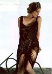
 Total Film Double Page Spread (DPS) – On this DPS, Total Film have used an iconic photo of Natalie Portman as the Black Swan, advertising the film and what it is about, generally. The dark, grunge colouring of the second page also keeps in tone with the film’s features. The type-writer-like font used suggest simplicity or old-fashion. Coloured in white, all the text stands out from the background and image. I like how the editors have used massive block lettering spreading across the two pages. Also, the text informing the reader that this story is a ‘PREMIERE REVIEW’, is placed in top right, separated from the rest of the text. I feel how the text is written in block capitals takes away from the emphasis on the title and top right text.


")
")


